

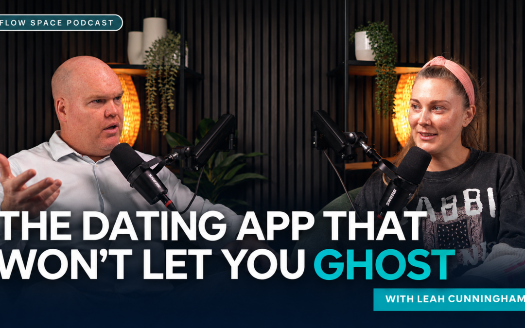
An ethical dating app starts with a practical question. What should happen when the app works? For Leah Cunningham, that question shapes everything from how many matches someone sees to what happens when a conversation goes quiet. The same principle applies to starting brand strategy with people before using AI.
Leah, a UX strategist and founder of Hi-Jump Dating, joined Noel Germishuizen on the Flow Space Podcast at Flow Space coworking in North Beach, Perth. Her work on the app gives us a way to think about ethical business in concrete terms. Every product has defaults. Those defaults tell people where to spend their time, what they can expect from each other and how easily they can walk away.
TL;DR Quick Answers
What makes a dating app ethical?
- Reward the outcome people came for. Track whether people can make useful connections and feel in control of their experience.
- Put care into the defaults. Set clear expectations, make safety tools easy to find and ask only for information you can explain.
- Make the business model part of the design conversation. Decide what people would happily pay for, then check whether earning more would make the product better for them.
Meet the guest
Leah Cunningham is the founder of Hi-Jump Dating and a UX strategist. On the Flow Space Podcast, she shares the choices she’s making as she develops a dating app concept around more thoughtful connections. The features below are ideas Leah describes in the interview. Learn more at the official Hi-Jump Dating website.
1. Decide what success looks like for an ethical dating app
A swipe is easy to count. A conversation that felt worth having is harder to measure. That difference matters because the thing a team measures is usually the thing it spends time improving.
Leah starts with a plain observation.
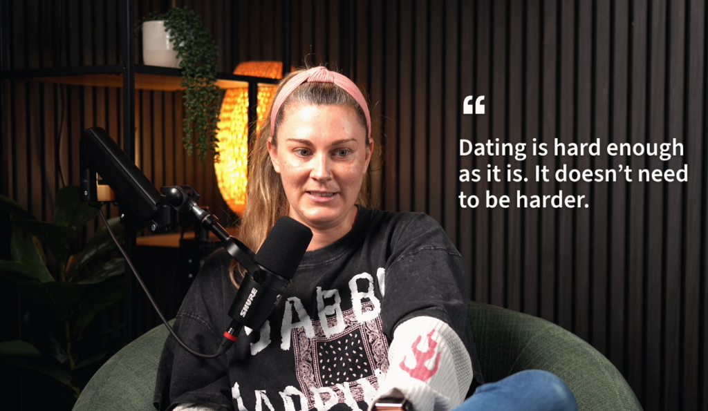
“Dating is hard enough as it is. It doesn’t need to be harder.”
Leah Cunningham
Imagine two members spend the same amount of time on an app. One has a conversation they’re glad they started. The other keeps looking because none of the profiles gives them much to go on. A dashboard might record the same session length for both. Ask each person how it went and you learn two different things.
For a founder, the practical move is to write down what progress feels like from the user’s side. Then pick a way to check it. A short optional survey could ask whether the matches shown felt relevant or whether people understood what to do next. You can track those answers alongside the numbers that keep the business running. That gives you something to refer to when two priorities pull in different directions.
There’s a useful question to add to an early interview. “Can you remember the last time you felt glad you opened a dating app?” Listen for the moment that made it worthwhile. It might be a profile that was easy to understand or a conversation that felt promising. Those details are easier to design around than a broad request for “better matches”. Keep the measure simple enough to revisit after launch, when the team has real behaviour to learn from.
2. Design for accountability and leave room for a safe exit
Leah describes a proposed seven-day reply window. The idea is to flag a pattern of unanswered conversations so silence has a consequence in the design. It’s a specific choice about what the product encourages. It also raises a harder question. How can you encourage consideration and respect a person’s right to end contact?
A delayed reply can mean any number of things. Someone might have lost interest, stepped away from the app or felt uncomfortable continuing. A timer can tell you when someone last replied. It can’t tell you why. A good design would explain what happens when the window closes and make it easy to end a match, block someone or report a concern. It would also give the team a way to check whether the rule catches the behaviour they meant it to catch.
The episode title uses ghosting as a hook. The work behind it is about building clearer expectations and learning where a rule needs discretion. That distinction matters for any business that tries to improve how people treat each other through a product.
Consider how the experience feels on both sides of a quiet conversation. The person waiting may appreciate knowing the chat has ended. The person leaving may need to do so without explaining themselves. A clear way to close a match can serve both needs. The team can test that idea with sample conversations and ask people what they expect the other person to see. The copy matters as much as the button.
3. Use friction where it gives people something back
Leah’s idea of offering a fixed set of matches each day changes what someone can do in a session. So does asking for enough profile information to start a useful conversation. Each choice adds a limit or asks for a little effort. The test is whether the person gets something back for it.
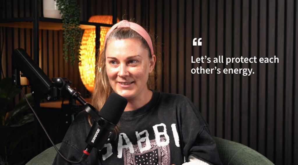
“Let’s all protect each other’s energy.”
Leah Cunningham
Fewer matches could leave someone more time to read each profile. The same limit might feel frustrating to someone who rarely sees a relevant match. A profile prompt might make a first message easier to write. Too many prompts could turn sign-up into an evening’s work.
That’s where speaking to real users earns its place. Ask someone to set up a profile while you watch. Find the moment they hesitate. Then ask them what they thought the app was asking for and what they hoped to get from giving it. A five-minute conversation can reveal whether you’ve added care or just another step.
There’s a version of this trade-off in plenty of businesses. A studio might ask a guest what they want to record before the session. That takes a minute and gives the team time to get the room ready. Asking the same guest to enter the same details three times serves nobody. The lesson from Leah’s profile idea is to make the benefit of the effort clear at the point you ask for it.
4. Make privacy and safety visible in the experience

Leah talks about photo verification as part of her design. It’s easy to see the appeal. People want some confidence that the profile they see belongs to a real person. Then comes the next set of questions. What is the check actually confirming? What information does it need? Who can see it? How long is it kept?
Those questions belong in the experience people use. A short explanation next to a verification prompt can tell someone why they’re being asked to do it and what a badge means. Clear controls can give them somewhere to go if a match makes them uncomfortable. Neither feature can tell someone everything about the person on the other side of the screen. Being precise about what each feature does helps people make their own decisions.
There’s a practical starting point for a small team. List each piece of personal information you ask for, then write one plain sentence about why you need it. Look for fields you can make optional or remove. Walk through the app as someone who wants to stop sharing information, report a problem or leave altogether. Notice where they have to guess.
5. Give revenue and user outcomes a place in the same meeting
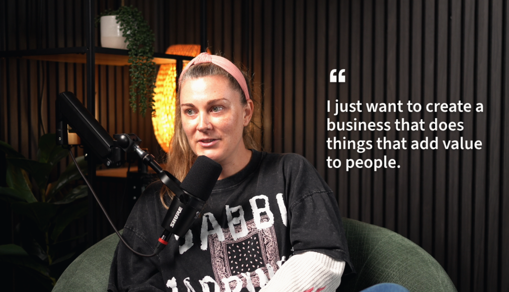
People can build a dating app they’re proud of and still need to pay for the work. Design, support and moderation all take time. Leah and Noel’s conversation about an ethical approach to business makes room for both questions. How will this pay for itself? What will we protect as we grow?
Imagine two paid features. One makes a useful service easier to deliver, and people can see what they’ll get before they buy. Another makes a problem inconvenient enough that people feel pressed to pay their way out of it. Both might make money this month. Each gives the team a different reason to keep building.
One way to keep the conversation honest is to put a business measure beside a user measure. If you track subscriptions, also track whether people understand what they’ve paid for and can find where to cancel. If you track how often people return, ask what brought them back and whether they achieved what they wanted. If a change lifts sales and creates more confusion, bring both results to the same meeting.
That is the value of getting specific about ethics. A team can discuss a trade-off while it still has choices. It can also point to a decision later and explain what it was trying to protect.
As the team grows, write down a few decisions you’d want a new colleague to understand. What will always be easy to find? Which choices need plain explanations? What would make you roll a feature back? Leave room to change your mind as you learn. A short record of those choices can help a future team understand why something was designed that way, especially when growth targets bring new pressure.
User trust by the numbers
In the Office of the Australian Information Commissioner’s 2026 national survey of 1,504 Australian adults, three findings stood out for product builders. These figures describe general privacy attitudes, rather than dating app outcomes. OAIC Australian Community Attitudes to Privacy Survey 2026
- 93% supported the most protective privacy settings by default. The settings people start with deserve as much care as the settings menu.
- 88% would choose to share minimal personal information. Give every required field a reason to be there.
- 61% agreed they don’t understand how organisations use their data. Put plain explanations next to the decision a person is making.
Essential resources for building a more thoughtful product
Bring safety into early design decisions
Use the eSafety Commissioner’s Safety by Design principles to plan how you’ll identify possible harms, give people usable controls and respond when something goes wrong.
See the app from a dater’s side
Read eSafety’s online dating guide to see the choices a person is asked to make about profiles, private information and contact. Use it to think through the moments where an app can make those choices easier.
Map where personal data goes
The OAIC guide to privacy impact assessments gives teams a method for describing a project and working through privacy risks before launch.
Understand how people use safety controls
The Australian Government research on control features in dating and social apps looks at people’s awareness and confidence. Use it to frame questions about whether your controls are easy to find and understand.
Review the path into and out of a subscription
The FTC and international regulator review of subscription design gives examples of interface choices that can make it harder for people to act on their preferences. Try walking through your own pricing, renewal and cancellation screens in one sitting.
Check the experience with people who use it differently
The Australian Government Digital Service Standard offers a reference for inclusive, user-centred design. Try your most important tasks with different devices and access needs.
Ask customers what they’re trying to do
Start with the business.gov.au guide to market research. Short interviews can show what customers are trying to achieve before you commit to a feature or success measure.
Final thoughts
What I like about Leah’s example is how ordinary the decisions sound. How many profiles do you show? What happens when someone stops replying? How much do you ask people to share? Each is small enough to discuss at a table and specific enough to test.
We hear versions of these questions at Flow Space coworking in North Beach, Perth. Put a few people who are building things in the same room and someone will ask, “Who does that actually help?” It’s a good question to bring to your next product or pricing meeting.
- Write down the outcome. Describe what a good experience looks like in the customer’s own terms.
- Pick one default to review. Ask what it encourages people to do.
- Make room for feedback. Speak with people who use your product and check what actually happens.
Top takeaways
- Choose a measure that reflects what users came to do.
- Make considerate behaviour easy and preserve people’s ability to leave safely.
- Give each extra step a clear benefit.
- Explain data collection where people make the choice.
- Review commercial results and user outcomes together.
FAQ on ethical dating app design
Q: What is an ethical dating app?
A: It’s a dating app designed around user interests, including meaningful connections, clear choices, privacy and safety. The way it makes money and measures success should support those interests.
Q: How is Hi-Jump Dating designed to discourage ghosting?
A: Leah Cunningham describes a proposed seven-day reply window that could flag patterns of unanswered conversations. The idea aims to encourage accountability.
Q: Can a dating app prevent every instance of ghosting?
A: Product design can encourage clear communication. People still decide when they want to reply or end contact. Easy ways to unmatch, block and report give them options when they need to leave a conversation.
Q: What does ethical product design look like in practice?
A: Explain choices where people make them, collect only the information you need and let people leave easily. Measure whether those choices help users reach their goal.
Q: Can an ethical dating app still make money?
A: Yes. A dating app can charge for a service people understand and value. The design challenge is to make sure earning more still serves the people who use it.
Watch the full episode of Flow Space Podcast
Watch Noel Germishuizen’s conversation with Leah Cunningham, UX strategist and founder of Hi-Jump Dating, on the full Flow Space Podcast episode.
Want to record a conversation of your own? Explore our Perth podcast studio. If you’re looking for a place to work alongside other people building things, see our North Beach coworking memberships.
Related read: Yes to Everything Until You Make It
Connect with Flow Space
Flow Space is a coworking space, meeting room venue and podcast studio in North Beach, Western Australia. The Flow Space Podcast shares conversations with people who chose to build something.
Website · LinkedIn · Instagram · Facebook · YouTube · Circle Community